CSS Grid Layout


The CSS Grid Layout Module offers a grid-based layout system, with rows and columns, making it easier to design web pages without having to use floats and positioning.
Grid Elements
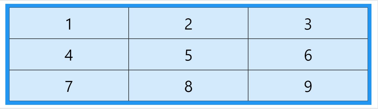
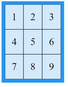
A grid layout consists of a parent element, with one or more child elements.
<div class="grid-container">
  <div class="grid-item">1</div>
  <div class="grid-item">2</div>
  <div class="grid-item">3</div>
  <div class="grid-item">4</div>
  <div class="grid-item">5</div>
  <div class="grid-item">6</div>
  <div class="grid-item">7</div>
  <div class="grid-item">8</div>
  <div class="grid-item">9</div>
</div>

Display Property
An HTML element becomes a grid container when its display property is set to grid or inline-grid.
.grid-container {
  display: grid;
}
Example
.grid-container {
  display: inline-grid;
}
Grid Gaps
The spaces between each column/row are called gaps.
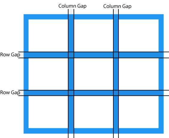
You can adjust the gap size by using one of the following properties:
column-gaprow-gapgap
Example
The column-gap property sets the gap between the columns:
.grid-container {
  display: grid;
  column-gap: 50px;
}
Example
The row-gap property sets the gap between the rows:
.grid-container {
  display: grid;
  row-gap: 50px;
}
Example
The gap property is a shorthand property for the row-gap and the column-gap properties:
.grid-container {
  display: grid;
  gap: 50px 100px;
}
Example
The gap property can also be used to set both the row gap and the column gap in one value:
.grid-container {
  display: grid;
  gap: 50px;
}
Grid Lines
The lines between columns are called column lines.
The lines between rows are called row lines.
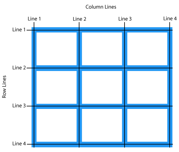
Refer to line numbers when placing a grid item in a grid container:
Example
Place a grid item at column line 1, and let it end on column line 3:
.item1 {
  grid-column-start: 1;
  grid-column-end: 3;
}
Example
Place a grid item at row line 1, and let it end on row line 3:
.item1 {
  grid-row-start: 1;
  grid-row-end: 3;
}
Thank you for giving valuable time. Happy Learning!!