CSS Flexbox


The flexbox or flexible box model in CSS is a one-dimensional layout model that has flexible and efficient layouts with distributed spaces among items to control their alignment structure ie., it is a layout model that provides an easy and clean way to arrange items within a container. Flexbox can be useful for creating small-scales layouts & is responsive and mobile-friendly.
Features of flexbox:
A lot of flexibility is given.
Arrangement & alignment of items.
Proper spacing
Order & Sequencing of items.
Bootstrap 4 is built on top of the flex layout.
Before the flexbox model, we had 4 layout modes:
Block: It is used to make sections in web pages.
Inline: It is used for text.
Table: It is used for two-dimensional table data.
Positioned: It is used for the explicit position of an element.
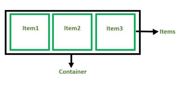
There are 2 main components of the Flexbox:
Flex Container: The parent “div” which contains various divisions is called a flex container.
Flex Items: The items inside the container “div” are flex items.
For creating the flexbox, we need to create a flex container along with setting the display property to flex.
<!DOCTYPE html>
<html>

<head>
    <title>Flexbox Tutorial</title>
    <style>
    .flex-container {
        display: flex;
        background-color: #32a852;
    }

    .flex-container div {
        background-color: #c9d1cb;
        margin: 10px;
        padding: 10px;
    }
    </style>
</head>

<body>
    <h2>Navdeep's Blogs</h2>
    <h4> Flexbox</h4>
    <div class="flex-container">
        <div>Item1</div>
        <div>Item2</div>
        <div>Item3</div>
    </div>
</body>

</html>
Output:

Flexbox Axes: While working with Flexbox, we deal with 2 axes:
Main Axis
Cross Axis
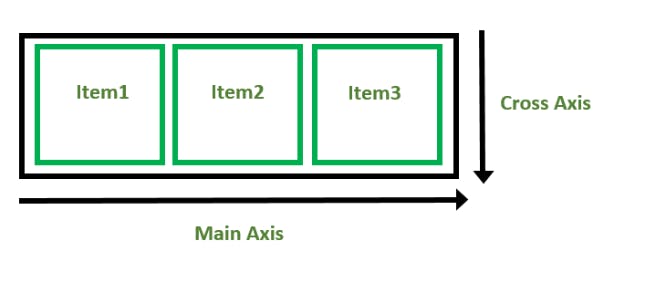
Main Axis:
By default, the main axis runs from left to right.
Main Start: The start of the main axis is called Main Start.
Main Size: The length between Main Start and Main End is called Main Size.
Main End: The endpoint is called Main End.
Main And Cross Axis

left to right:
flex-direction: row;
right to left:
flex-direction: row-reverse;
top to bottom:
flex-direction: column;
bottom to top:
flex-direction: column-reverse;
Cross Axis: The cross axis will be perpendicular to the main axis.
By default, Cross Axis runs perpendicular to the Main Axis i.e. from top to bottom.
Cross Start: The start of the Cross axis is called Cross Start.
Cross Size: The length between Cross Start and Cross End is called Cross Size.
Cross End: The endpoint is called Cross End.
Thank you for your time. Happy Learning